National Trust Sutton Hoo
Hoo’s waking up. The National Trust don’t go closing the doors easily, especially for 6…

The National Trust don’t go closing the doors easily, especially for 6 months, but this is exactly what happened with Sutton Hoo, one of the largest and most important properties in their portfolio. With thousands of daily visitors, and known worldwide, Sutton Hoo underwent a multi-million pound project to totally transform the visitor brand experience.
With so much due to be revealed even after a soft launch the team needed a campaign to manage expectations and communicate the future developments while each phase was completed.
This campaign we worked with Sutton Hoo on:


We developed the creative campaign line ‘Hoo’s Waking Up’ to communicate and the idea that something is happening or uncovering. As the sun rises and long shadows start to shorten, new experiences are being revealed while others are reappearing.
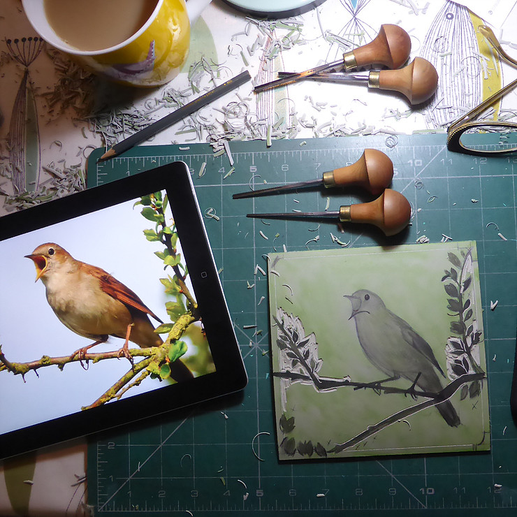
As part of the campaign we used commissioned images from lino cut illustrator Michelle Hughes michellehughes.co.uk in her garden studio, Michelle created these simple but stylised silhouettes based on photographs, cutting these shapes into lino, she hand prints with an etching press, using oil-based inks creating tonal blocks of colour.
Sally | National Trust

Part of the initial opening was a new ‘River View’ trail which opened along with arguably the most impressive structure, a full size skeleton representation of the Anglo-Saxon ship which was discovered on-site.
To communicate the changes and developments we created a suite of leaflets illustrating what to expect over the course of the year before the complete experience in the Autumn. Alongside the leaflets we created a range of informative courtyard banners and signage, welcome/exit signage and café POS.
We wanted all visitors to be enthused by the changes, but have the desire to return again and again as each phase is completed. Due to the nature of the build, various interpretation signs doubled up as barriers to keep the visitors safe and inspiring them whilst educating about the developments.
Hoo’s waking up. The National Trust don’t go closing the doors easily, especially for 6…

bean-to-bar craft chocolate. Inspired by Thomas Tosier, personal chocolate maker to King George I, Tosier…

less manga. Ichiban were looking to reposition their Yumie Sushi brand, moving away from a…

smoking hot since 1959. Suffolk-based restaurant and smokehouse Pinney’s of Orford, a producer and supplier…

Brightwell Barns
Unit 3, Ipswich Rd
Ipswich
IP10 0BJ
3rd floor
86 – 90 Paul St
London
EC2A 4NE
| Cookie | Duration | Description |
|---|---|---|
| cookielawinfo-checbox-analytics | 11 months | This cookie is set by GDPR Cookie Consent plugin. The cookie is used to store the user consent for the cookies in the category "Analytics". |
| cookielawinfo-checbox-functional | 11 months | The cookie is set by GDPR cookie consent to record the user consent for the cookies in the category "Functional". |
| cookielawinfo-checbox-others | 11 months | This cookie is set by GDPR Cookie Consent plugin. The cookie is used to store the user consent for the cookies in the category "Other. |
| cookielawinfo-checkbox-advertisement | session | Set by the GDPR Cookie Consent plugin, this cookie is used to record the user consent for the cookies in the "Advertisement" category . |
| cookielawinfo-checkbox-necessary | 11 months | This cookie is set by GDPR Cookie Consent plugin. The cookies is used to store the user consent for the cookies in the category "Necessary". |
| cookielawinfo-checkbox-performance | 11 months | This cookie is set by GDPR Cookie Consent plugin. The cookie is used to store the user consent for the cookies in the category "Performance". |
| elementor | never | This cookie is used by the website's WordPress theme. It allows the website owner to implement or change the website's content in real-time. |
| viewed_cookie_policy | 11 months | The cookie is set by the GDPR Cookie Consent plugin and is used to store whether or not user has consented to the use of cookies. It does not store any personal data. |
| Cookie | Duration | Description |
|---|---|---|
| _ga | session | The _ga cookie, installed by Google Analytics, calculates visitor, session and campaign data and also keeps track of site usage for the site's analytics report. The cookie stores information anonymously and assigns a randomly generated number to recognize unique visitors. |
| _ga_MZT4R2822Y | session | This cookie is installed by Google Analytics. |